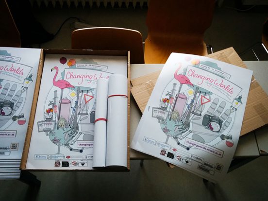
New conference year, new poster! It doesn’t make a lot of sense, but somehow printed artifacts make a project or event feel “more real”.
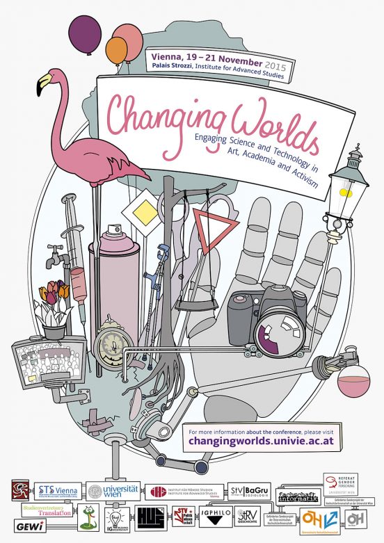
We went with a similar style as for the last conference, but this time I chose to do a digital illustration since that makes the individual elements reusable.
The main idea is the same as for the first conference poster in 2014, but our choice of artifacts reflects that this instalment of the conference focuses more on art and activism. While both the artwork and topic of the first conference were leaning more towards historical reflections, this year’s vibe is both a bit dystopian and very playful.
I kept yellow as the highlight colour, but replaced the main colours from 2014 (Blues and Greens) with Pinks and Purples.
And this is the full artwork. What I like most about this design is the potential to use all the little illustrations for the small print products that often feel a bit boring. It feels very fitting for this event to be able to play with the details that way.
Currently, I’m trying to make a plan to enlarge some of the motifs as a decoration for the conference venue.
I think this design is going to be a lot of fun.


