
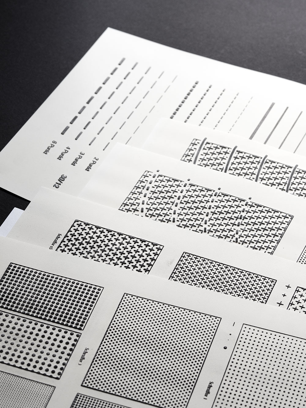
A number of pages with different surface patterns and intersections of lines and patterns
My new design project is interesting. It mostly consists of maths and programming, combined with social research. After that, finally, some layouting and typesetting – but the final product will not necessarily look pretty. That’s alright though, since it’s not made to be looked at: We are working on teaching materials for blind and visually impaired students. More specifically, a graphics catalogue to be used in high school maths education.
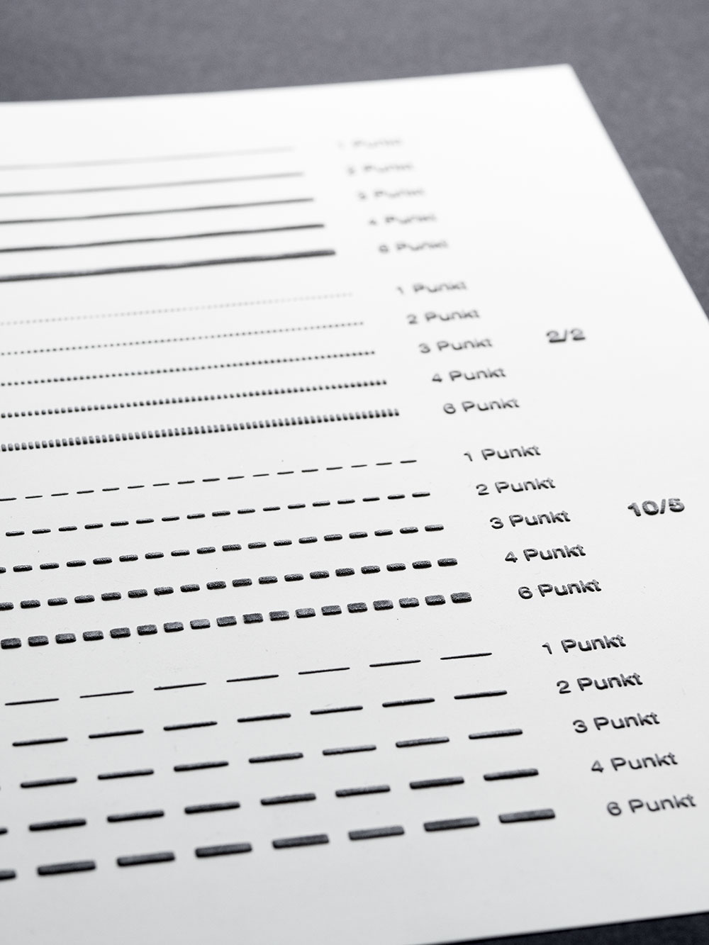
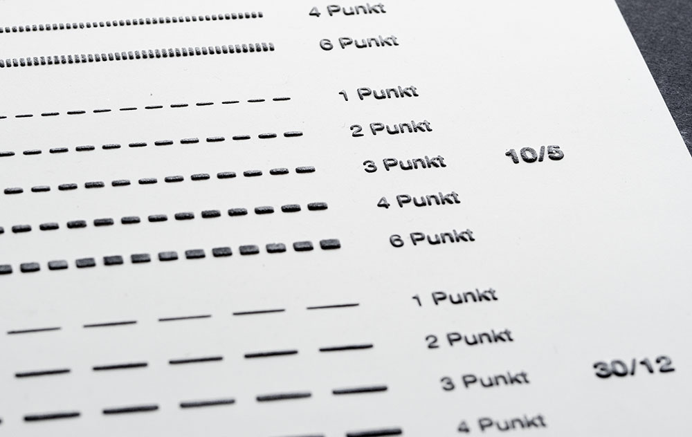
How do dashed lines behave and feel? How much difference is needed so we can distinguish styles by touch?
It’s hard to get a good picture of the three dimensional quality of the paper.
And this is exactly why I love being a designer: Getting to make things that work, no matter how contradictory the requirements may seem initially.
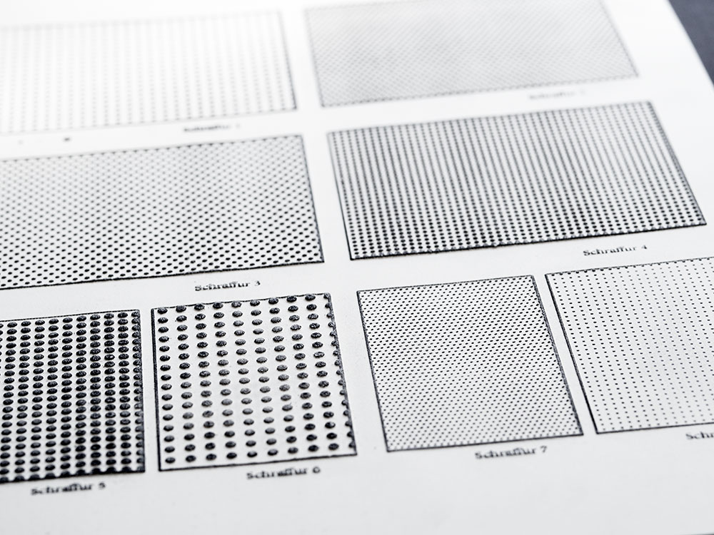
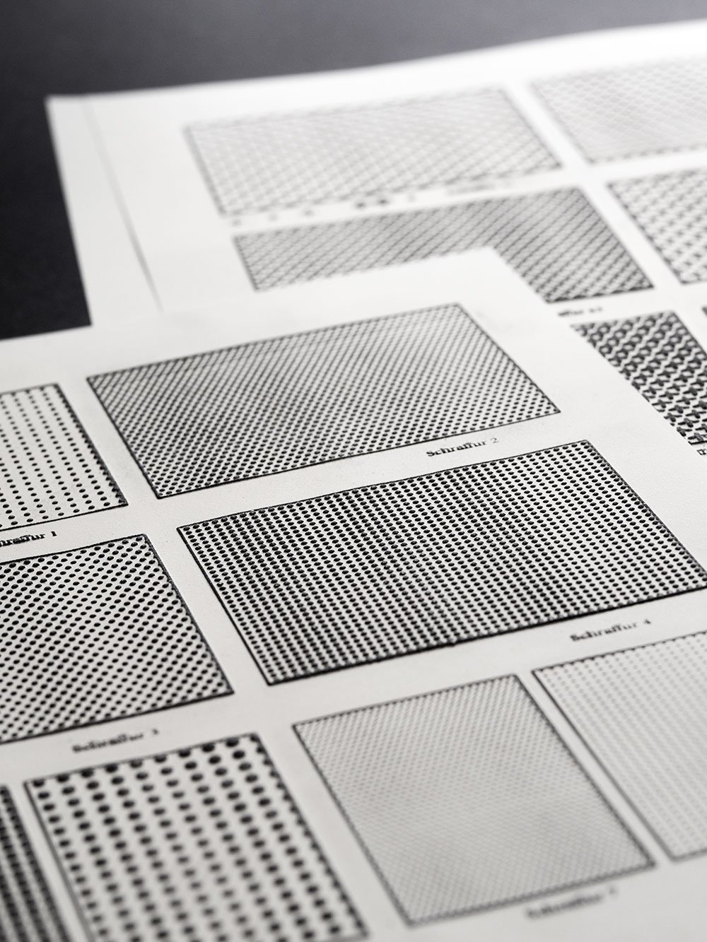
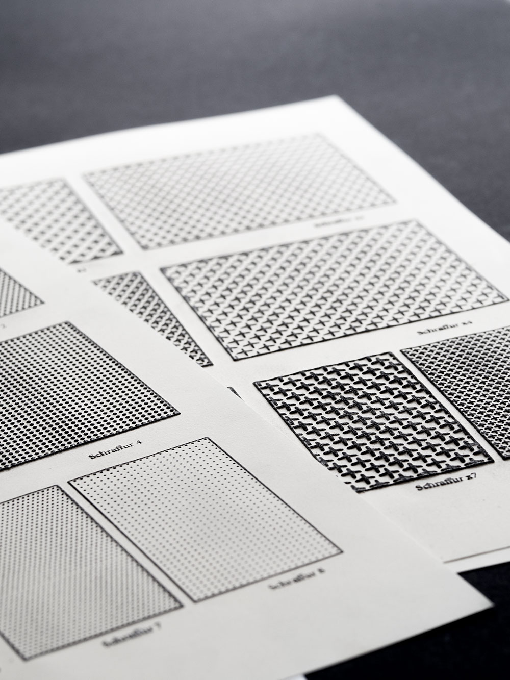
Here I am trying to come up with different patterns to replace what would usually be different colours. After creating a lot of “test squares” we had teachers and students test them at the school.
I’m really looking forward to working on this project. I have never used swell paper before I was approached with this project, but it’s an exciting material. It makes it possible to create tactile graphics with a standard printer and a special device to actually make the print tactile.
The first step is testing the properties of the material we are working with so I can get a feeling for it. We are closely working with both blind students and teachers to learn the basics about tactile graphics and typesetting in Braille, but also about the Braille system itself.
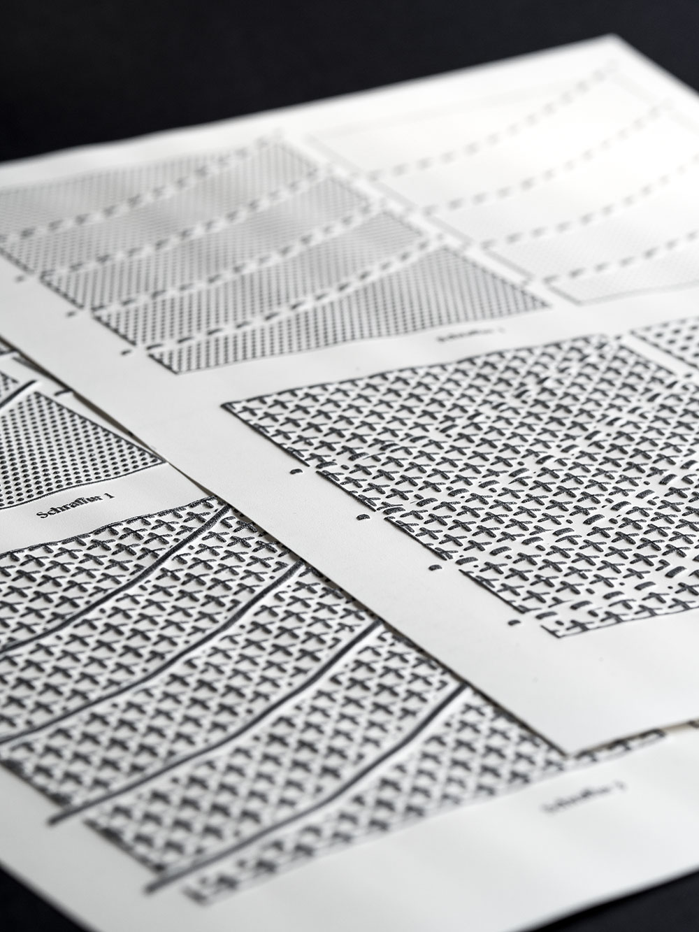
Intersections and Lines that go over what would traditionally be coloured fields are much harder to distinguish in tactile graphics.
Next up: learning how to actually read Braille.