Journal

My Project Journal – Visual Design

This blog is part diary, part portfolio. Often, the project's final products are not published yet – I hope you enjoy the process and the journey through the projects!

The journal is not currently translated, posts appear in the language that makes the most sense in context.

Neuer Name, neues Logo für kontexte.

Das Bild zeigt das Logo des Vereins kontexte auf weißem Hintergrund. Das Logo ist eine schwarze Linie, die ein Quadrat bildet. Unten links ist das Quadrat es offen, dort steht der name kontexte. In der Animation fährt der Name nach oben, dann wird der neue Namenszusatz des Vereins unter dem Logo eingeblendet. Der neue Name lautet: kontexte. Netzwerk zur Förderung von Kultur- und Sozialwissenschaftlerinnen.

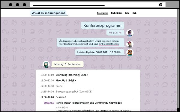
Der Verein kontexte., für den ich ehrenamtlich tätig bin, hat vor kurzem seinen Namen geändert. Der Verein heißt jetzt: kontexte. Netzwerk zur Förderung von Kultur- und Sozialwissenschaftlerinnen.

Die Sozialwissenschaften wurden zusätzlich in den Namen aufgenommen, weil das Netzwerk seit seiner Entstehung mehr in diese Richtung gewachsen ist. Außerdem ist mittlerweile ein guter Teil des Vereinsvorstandes (inklusive mir) nicht mehr rein in den Kulturwissenschaften anzusiedeln.

Um die Namensänderung offiziell zu machen, habe ich nicht nur das Logo aktualisiert, sondern auch eine kleine Animation erstellt.

Interactive layouting concept

Today I want to document a design project that is also a proof of concept. It combines a few ideas I’ve been curious to try out, and they all came together for this little project.

Initially, I was asked to design a logo for an academic conference in the summer of 2021. This conference was completely online due to travel restrictions and safety concerns, but the team was trying to make the event feel more “real”.

The picture shows a stylized browser window displaying a conference website. We are on the “program” page, and the content is displayed as a text messsage conversation. Different avatars have speech bubbles with the Title of the Page, links to the different conference days, time of the last update, and then a bigger text frame containing the conference program by day.
The program as shown on the website

Continue reading…

Stage 2: Experiments

Now that I understand how microcapsule paper works, it’s time to get a bit nerdy with material science.

Most blind students in Austria attend regular schools, so they will have sighted people around them. This is why we decided to try and make the materials work better for this integrative approach by including the text in schwarzschrift (literally black print, I don’t think this term exists in English so I’ll stick to the German) too. Schwarzschrift here, for us, is red though. There’s technical reasons for that, but maybe I need to explain how swell paper works first.

Pages of swell paper with test lines in different line styles and red writing in different shades that has stayed flat in the swelling process
Testing different shades of red by applying different heat settings.

Continue reading…

Stage 1: How to read Braille

Pages of swell paper with different surface patters consisting of dots, lines and crosses
A number of pages with different surface patterns and intersections of lines and patterns

My new design project is interesting. It mostly consists of maths and programming, combined with social research. After that, finally, some layouting and typesetting – but the final product will not necessarily look pretty. That’s alright though, since it’s not made to be looked at: We are working on teaching materials for blind and visually impaired students. More specifically, a graphics catalogue to be used in high school maths education.

Continue reading…