Today I want to document a design project that is also a proof of concept. It combines a few ideas I’ve been curious to try out, and they all came together for this little project.
Initially, I was asked to design a logo for an academic conference in the summer of 2021. This conference was completely online due to travel restrictions and safety concerns, but the team was trying to make the event feel more “real”.
The name of the conference itself is programmatic:
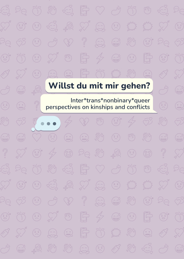
Willst du mit mir gehen?
Inter*trans*nonbinary*queer kinships and conflicts – ein Vernetzungstreffen für Wissenschaft, Kunst, Aktivismus und Leben
The organizing team wanted to create meaningful co-presence, a shared experience — not just another zoom event. Similar to the conferences I have been involved in as an organizer, the team wanted the visual design to contribute to that mission.
For the design, I chose to replicate an online messenger. As a visual, it is fun and playful as well as a nod to the circumstances. The topics of the conference circle around contemporary socialities, and the pandemic has had a huge impact on what being a social being means. The emojis in the background symbolize all the emotions being made visible in conflict as well as academic discourse.
The organizing team for the conference was spread out over several cities and countries, so everything about the conference was “online first”. We identified this as a potential problem early on: While a few people involved have frontend/web development skills, access to design software was a problem. The team needed to be able to adapt the content such as the schedule on the fly, which means that having a logo alone did not really solve their design problems. I had to provide some sort of open documents they could use, which is not an ideal situation.
I came up with the idea to do a browser-based design, avoiding traditional design software and associated access problems entirely. We started with a basic HTML- and CSS-based design, only creating the vector illustrations for the avatar and background externally. The HTML stayed very simple in order to be easily adaptable. The layout, speech bubbles and the like were built entirely in CSS. The background pattern is randomized and rebuilds a new variation on reload.
This had many advantages: Everyone with basic HTML/CSS skills could easily adapt the text, add new elements where needed, and make other small changes. The result can easily be hosted, or pasted into a website builder as part of a bigger page. The entire design is responsive, so it works well on different devices.
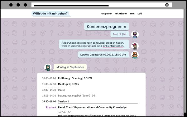
We optimized for smartphones, tablets, desktop PCs, and a PDF printer. Below, you can download the print version of the programme as well as the call for contributions that were created this way
What I like about the solution we ended up with: Images for social media can easily be created on the fly, for/with any device and screen size one wants to optimize for.
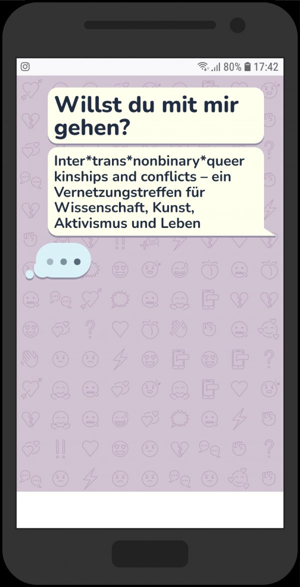
As you can see in the example shown in the smartphone mockup, one could access the logo online, screenshot it, and have the perfect image to share on Instagram stories for the device they’re on — and even have a designated space for comments. As a process, this is unusual. But it is well in line with contemporary media usage. For this project, we attempted to build a solution that allows users to organically interact with rather than forcing them into a foreign-to-them design workflow.
This was a great experiment, and it worked well for our specific use case – and a very particular group of users.
 Printversion des Programms
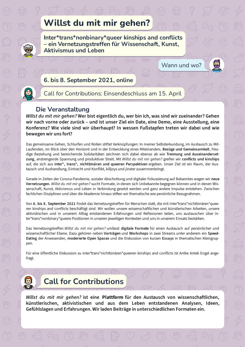 Der vollständige Call for Contributions