Now that I understand how microcapsule paper works, it’s time to get a bit nerdy with material science.
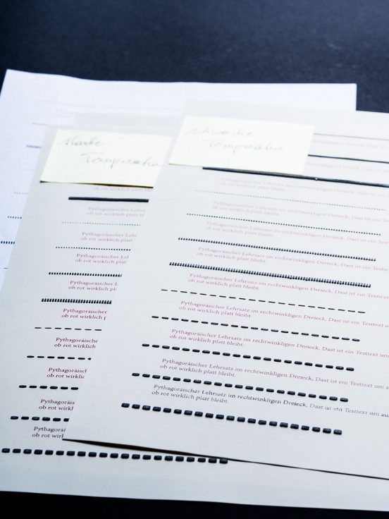
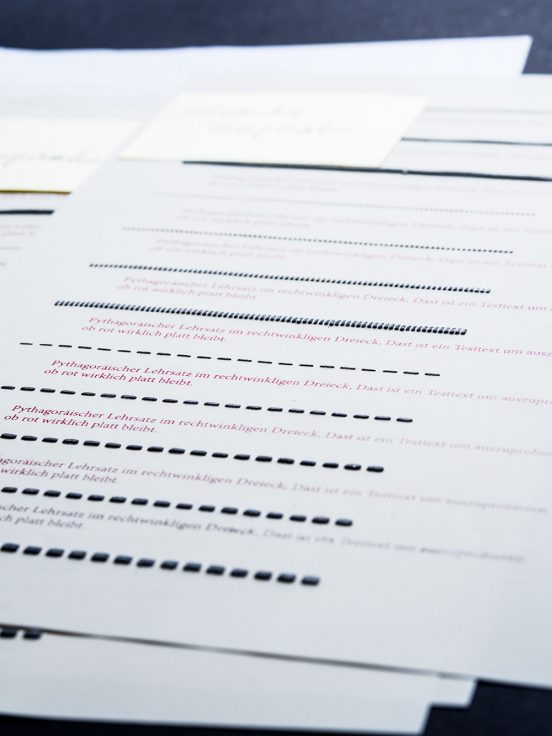
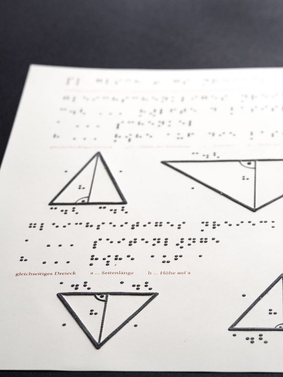
Most blind students in Austria attend regular schools, so they will have sighted people around them. This is why we decided to try and make the materials work better for this integrative approach by including the text in schwarzschrift (literally black print, I don’t think this term exists in English so I’ll stick to the German) too. Schwarzschrift here, for us, is red though. There’s technical reasons for that, but maybe I need to explain how swell paper works first.


The basic idea is simple: Microcapsule paper, or swell paper, reacts to heat. It is being printed on like regular paper, but after printing it is put through a machine (the fuser) that heats paper up using infrared light. When the infrared light hits the printed pigment, the paper underneath the pigment gets hot enough to swell up (It’s a bit like popcorn).
Since the swelling is caused by a combination of black pigment on the special paper and infrared light, changing parameters means it is possible to print content that won’t puff up when put through the fuser. Specifically, red ink absorbs less infrared light and heat and therefore doesn’t make the paper swell up.
So why is this a good idea? Braille has a very low density of information, so one page can fit much less text than it would with schwarzschrift. Space on a Braille page is precious, so we do not want to take up space with text that doesn’t need to be tactile. Additionally, having the schwarzschrift parts swell up would be confusing when reading the Braille and tactile graphics.
If the schwarzschrift text does not swell up in the production process, it can just exist in the white space of the tactile page. Reliably being able to have content that swells and content that does not means we can make the most out of the limited space we have available while still providing all the information for different readers: It simply adds another layer of information that is imperceptible for those who don’t need it.


