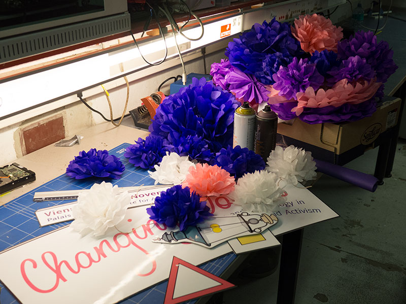
I have been incredibly busy lately, but last week the 2nd installment conference I have been organising took place. And we made lots of decorations. Paper puffs!
The journal is not currently translated, posts appear in the language that makes the most sense in context.
I have been incredibly busy lately, but last week the 2nd installment conference I have been organising took place. And we made lots of decorations. Paper puffs!
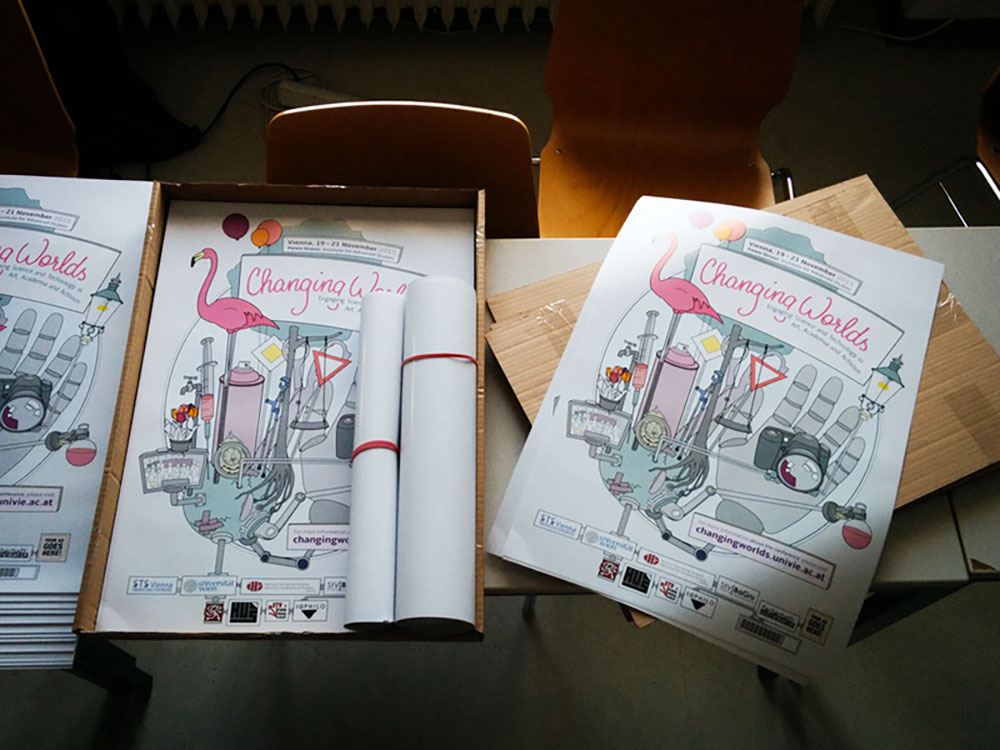
New conference year, new poster! It doesn’t make a lot of sense, but somehow printed artifacts make a project or event feel “more real”.
We went with a similar style as for the last conference, but this time I chose to do a digital illustration since that makes the individual elements reusable.
The main idea is the same as for the first conference poster in 2014, but our choice of artifacts reflects that this instalment of the conference focuses more on art and activism. While both the artwork and topic of the first conference were leaning more towards historical reflections, this year’s vibe is both a bit dystopian and very playful.
The poster for the first Changing Worlds Conference is off to the printers!
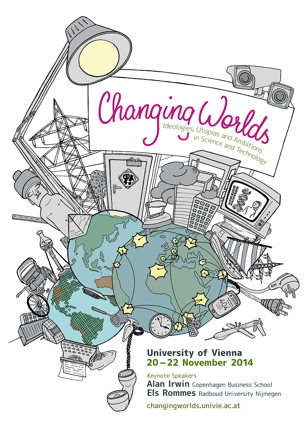
With this poster I wanted to illustrate the multiplicity of human experiences that is also the basis for the name of the conference, ”Changing Worlds”.
We are used to seeing maps of the world centering (and disproportionately enlarging) Europe and North America. So the first decision we made when we decided to put a globe on the poster was to duplicate it to feature all continents.It was very interesting since deviating from the image most people are used to is confusing at first. The 3 globes also appear in different styles, highlighting that maps are always purpose-driven rather than neutral objects.
This will be the poster for a conference I’m organizing with a few fellow students.
We have started organizing a conference at the department of Science and Technology Studies. The idea is to bring together researchers, artists, and other people interested in how humans interact with technology.
The conference itself will be an experiment: We want to bring together academics and non-academics, creating a unique space for exchange. We want to explore the limits of what an academic conference can be, and invite people who would not usually attend events at an university.
We have decided early on that in order to reach a wider audience, our conference has to look good. And this includes having a proper logo and overall design – which I am responsible for.
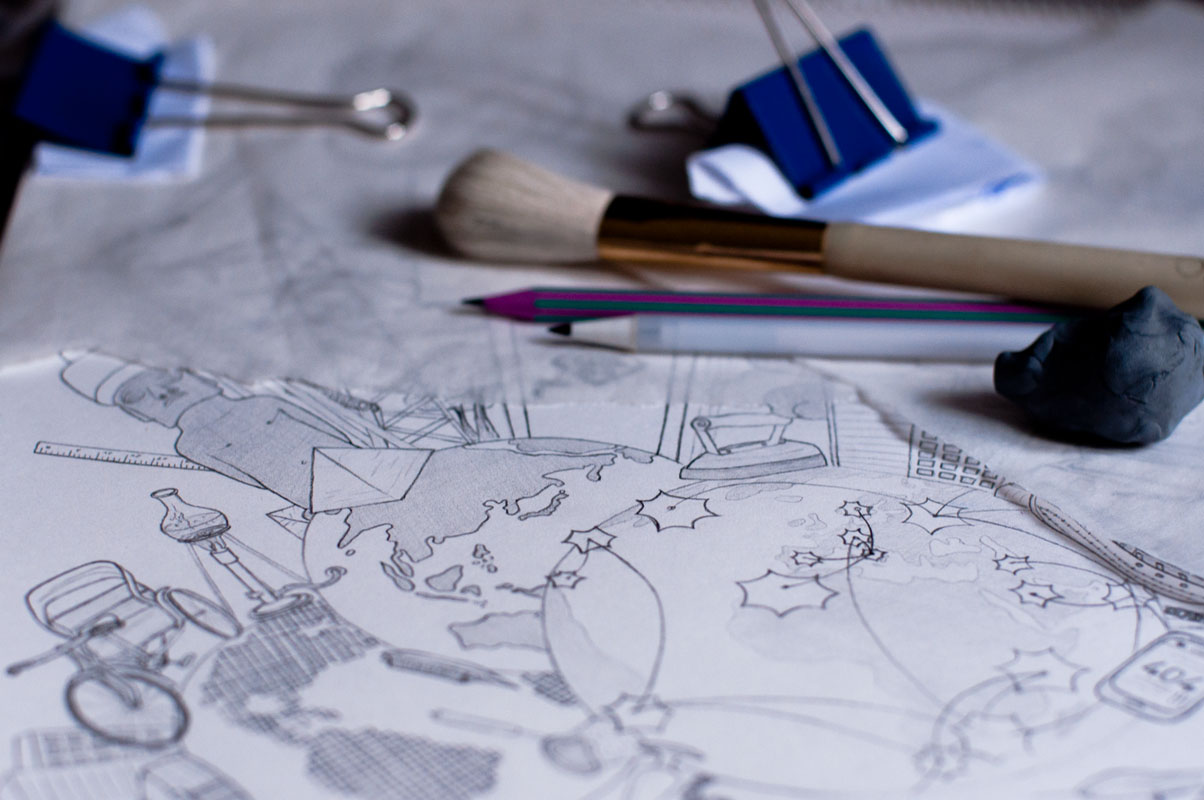
I decided to go for an analog illustration and color it digitally later. Above you can see an early stage of the illustration before being scanned.
I seem to like pixel drawings. Initially, a friend asked me to draw a little skyline for the header of his new website. Then I just went on and on … you know how it goes.
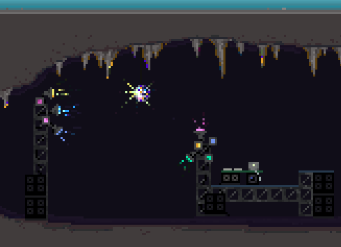
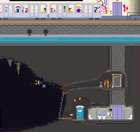
In the last pixel post, I wrote that the cave was supposed to become a cinema. But as it evolved, it became some sort of an underground party location.
Now it’s huge and the file has 130 layers prepared for all sorts of weird animations that might or might not actually work at some point. But still no elder gods …