
Not much to add to the previous posts, but we have a bunch of actual pages for the braille project ready, and we got some of them printed for testing.
Not much to add to the previous posts, but we have a bunch of actual pages for the braille project ready, and we got some of them printed for testing.
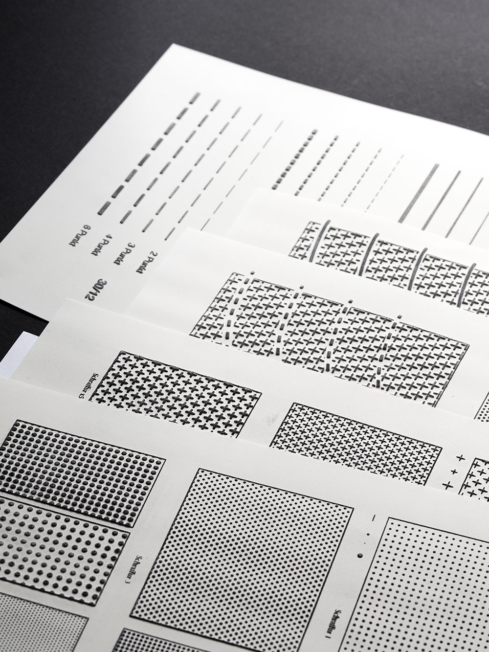
Now that I understand how microcapsule paper works, it’s time to get a bit nerdy with material science.
Most blind students in Austria attend regular schools, so they will have sighted people around them. This is why we decided to try and make the materials work better for this integrative approach by including the text in schwarzschrift (literally black print, I don’t think this term exists in English so I’ll stick to the German) too. Schwarzschrift here, for us, is red though. There’s technical reasons for that, but maybe I need to explain how swell paper works first.
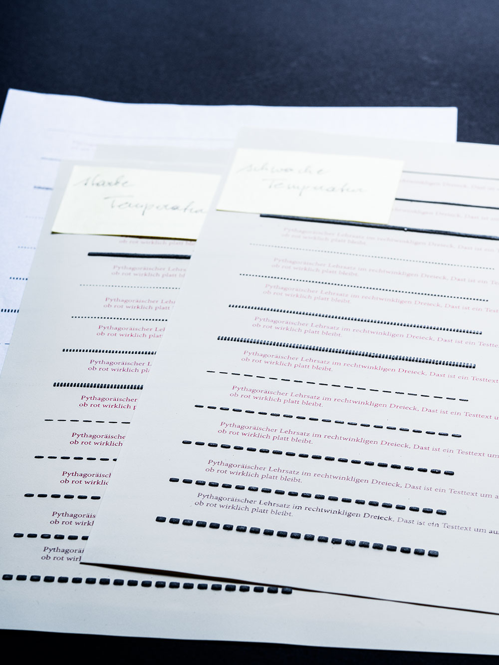
My new design project is interesting. It mostly consists of maths and programming, combined with social research. After that, finally, some layouting and typesetting – but the final product will not necessarily look pretty. That’s alright though, since it’s not made to be looked at: We are working on teaching materials for blind and visually impaired students. More specifically, a graphics catalogue to be used in high school maths education.

And the conference is over. I wish I had found the time to take more pictures of all the signs and other print products and decorations we made for the conference besides pink and purple paper puffs, but I was too busy.
You can have a look at the conference program if you want to know more about the conference topics and exhibitions.
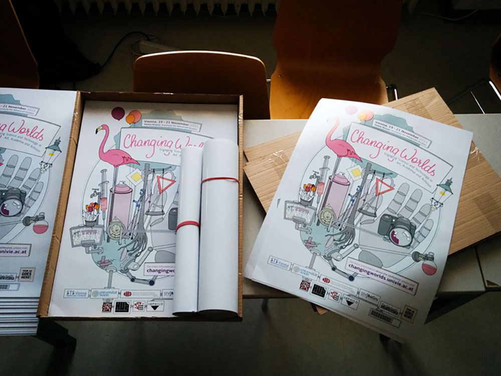
The image above shows some of the print products we made for the conference, in our continuous effort to make it feel less like a stuffy academic event and more like a space for exchange, curiosity and experimentation.
Turns out organizing a conference with loads of experimental features and events (such as a sound performance installation and an art exhibition) is even more work than organizing a “regular” academic conference. But it was definitely worth the extra effort.
It was a wonderful event and we got lots of positive feedback from everyone attending!
New conference year, new poster! It doesn’t make a lot of sense, but somehow printed artifacts make a project or event feel “more real”.
We went with a similar style as for the last conference, but this time I chose to do a digital illustration since that makes the individual elements reusable.
The main idea is the same as for the first conference poster in 2014, but our choice of artifacts reflects that this instalment of the conference focuses more on art and activism. While both the artwork and topic of the first conference were leaning more towards historical reflections, this year’s vibe is both a bit dystopian and very playful.