Journal

Mein Projekttagebuch – Visual Design

Dieser Blog ist gleichermaßen Tagebuch und Portfolio. Viele der Projekte sind (noch) nicht öffentlich zugänglich – Ich hoffe, Sie finden die Entstehungsprozesse interessant!

Der Blog wird aktuell nicht übersetzt, Beiträge erscheinen entweder auf Deutsch oder Englisch.

Robot Invasion

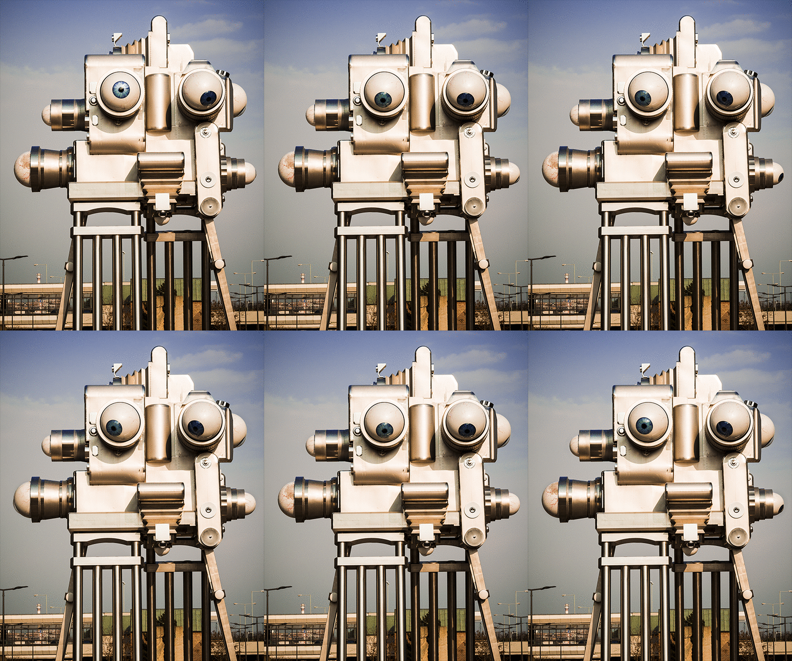
I randomly stumbled across another installation by David Černý while I was out exploring the end of the world one of Prague’s outer districts and looking for birthday cupcakes.

<a

Here is a quick gif I made while soaking up all the sun I could get after 2 weeks of end-of-march-snow. It was a glorious, colourful late afternoon and after 2 hours everything went back to cold and rainy. But I got sun and birthday cupcakes, and even at the same time!

After the conference

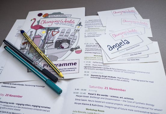
A few programmes and nametags (with pre-printed pronoun options) arranged on a desk with some pencils

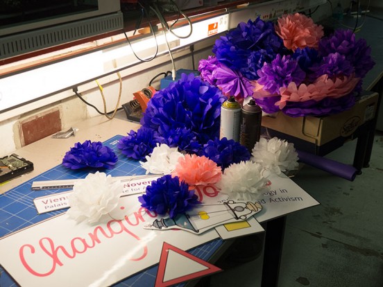
And the conference is over. I wish I had found the time to take more pictures of all the signs and other print products and decorations we made for the conference besides pink and purple paper puffs, but I was too busy.

You can have a look at the conference program if you want to know more about the conference topics and exhibitions.

The image above shows some of the print products we made for the conference, in our continuous effort to make it feel less like a stuffy academic event and more like a space for exchange, curiosity and experimentation.

Turns out organizing a conference with loads of experimental features and events (such as a sound performance installation and an art exhibition) is even more work than organizing a “regular” academic conference. But it was definitely worth the extra effort.

It was a wonderful event and we got lots of positive feedback from everyone attending!
New Poster!

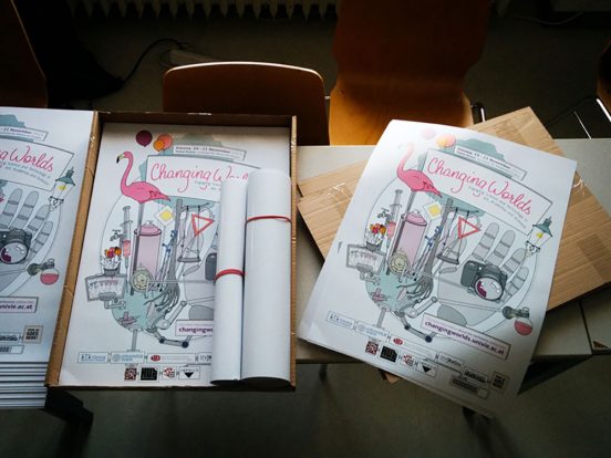
Tables in a lecture room with posters for the Changing Worlds Conference
Look what just came from the printers!

New conference year, new poster! It doesn’t make a lot of sense, but somehow printed artifacts make a project or event feel “more real”.

We went with a similar style as for the last conference, but this time I chose to do a digital illustration since that makes the individual elements reusable.

The main idea is the same as for the first conference poster in 2014, but our choice of artifacts reflects that this instalment of the conference focuses more on art and activism. While both the artwork and topic of the first conference were leaning more towards historical reflections, this year’s vibe is both a bit dystopian and very playful.

Continue reading…

Changing Worlds?

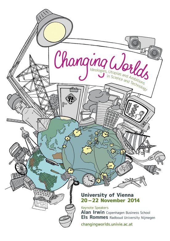
The poster for the first Changing Worlds Conference is off to the printers!

Poster for the Changing Worlds Conference 2014. On a white Background, 3 views of planet earth are in the bottom left corner. Together they show a full world map. A lot of cultural and technical artifacts grow out of the worlds. On top we have a billboard with the conference title, the contact details are in the bottom right corner.
The pencil sketch became a full poster.

With this poster I wanted to illustrate the multiplicity of human experiences that is also the basis for the name of the conference, ”Changing Worlds”.

We are used to seeing maps of the world centering (and disproportionately enlarging) Europe and North America. So the first decision we made when we decided to put a globe on the poster was to duplicate it to feature all continents.It was very interesting since deviating from the image most people are used to is confusing at first. The 3 globes also appear in different styles, highlighting that maps are always purpose-driven rather than neutral objects.

Continue reading…